
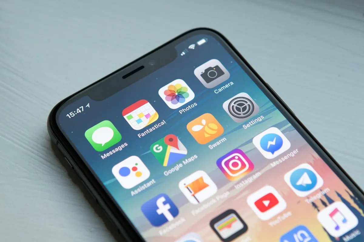
Why St. George Businesses Need a Mobile-First Website

More than 70% of the local searches happening in St. George right now are on phones. People looking for a restaurant near Zion, a plumber in Washington Fields, a salon off St. George Boulevard: they're all on a 6-inch screen. If your St. George mobile website doesn't work on that screen, you're invisible to most of your potential customers.
I see it constantly. A business owner spends $3,000 on a website, checks it on their desktop, thinks it looks great, and moves on. Six months later they're wondering why the phone isn't ringing. The answer is usually sitting in their Google Analytics: 73% mobile traffic, 89% bounce rate on mobile. The site looks fine on a laptop. On a phone, buttons overlap, text is microscopic, and the contact form requires pinch-zooming to fill out.
That's the gap I want to talk about today.
What "Mobile-First" Actually Means for a St. George Mobile Website
Mobile-first design means you build the phone version of your site before the desktop version. Not after. Not as an afterthought. The phone layout comes first, and then you scale up for larger screens.
This is the opposite of how most sites were built even five years ago. The old approach was to design a full desktop site and then squeeze it down to fit a phone. That squeeze usually broke things: menus that don't open, images that load at full resolution and kill your load time, text that wraps in weird places.
Mobile-first flips the priority. You start with the smallest screen and the most constrained experience, get that right, and then add complexity for bigger screens. The result is a site that works perfectly on the device most of your customers are actually using.
This isn't a theoretical best practice. Google has been using mobile-first indexing since 2019. That means Google looks at the mobile version of your site to decide where you rank. If your mobile experience is broken, your rankings suffer across the board, not just on phone searches.
Why This Matters More in St. George Than Most Places
St. George has a few dynamics that make mobile traffic even more dominant than the national average.
Tourism traffic is almost entirely mobile. Southern Utah tourism brings nearly 5 million visitors through the area every year, and most of them pass through St. George. They're searching for food, lodging, gear shops, and activities from their phones while driving down I-15 or sitting at their campsite. They're not opening a laptop. If your restaurant or outfitter doesn't load fast on a phone, they'll tap the next result.
Snowbirds plan on their phones. St. George's winter population swells with seasonal residents from the Pacific Northwest and Mountain West. These folks are researching services, dentists, gyms, and restaurants from their phones before they even arrive. A St. George mobile website that loads in under 2 seconds gets their business. One that takes 6 seconds doesn't.
New residents are pouring in. Washington County has been one of the fastest-growing areas in Utah for years. People moving to the area search for everything from "best pizza in St. George" to "CPA near me" on their phones. They don't have existing relationships with local businesses yet. Your website is their first impression, and they're viewing it on a phone.
Commuters and service searches are mobile by default. Someone's AC breaks in July when it's 112 degrees outside. They're not walking to their desktop. They're Googling "AC repair St. George" from a phone. Same with plumbers, locksmiths, tow trucks, and every other service that gets searched in the moment.
If you're a local business and your St. George SEO strategy doesn't account for mobile, you're building on a cracked foundation.
The Real Cost of a Bad Mobile Experience
Here's what happens when someone hits your site on a phone and it doesn't work well.
They leave. Google's own data shows that 53% of mobile visitors abandon a site that takes more than 3 seconds to load. Three seconds. Most poorly optimized sites take 6 to 10 seconds on a mobile connection.
They don't come back. A study by Google found that 61% of users are unlikely to return to a mobile site they had trouble accessing. They just move on to a competitor.
Your rankings drop. Google measures Core Web Vitals, which include loading speed, visual stability, and interactivity. All of these are measured on the mobile version of your site. Poor scores push you down in search results. We covered the technical side of this in our speed optimization guide, and every point in that post hits harder on mobile.
You lose the call. For service businesses, the most valuable action on your site is a phone call. On mobile, a tap-to-call button should be obvious and reachable with a thumb. If your phone number is buried in a footer that requires scrolling through a broken layout, you're losing calls every single day.
Let me put a number on it. If your site gets 500 mobile visitors per month (modest for a local business with decent SEO) and your mobile bounce rate is 80% instead of 50%, that's 150 potential customers per month who left without contacting you. Even if only 10% of those would have converted, that's 15 lost customers per month. For a service business charging $200 per job, that's $3,000 per month in lost revenue.
The math varies, but the direction doesn't. A broken mobile experience costs you real money.
What a Good St. George Mobile Website Looks Like
You don't need anything fancy. You need the basics done right.
Fast loading. Under 2 seconds on a 4G connection. This means optimized images (WebP format, properly sized), minimal JavaScript, and clean code. A custom-coded site without a bloated CMS will naturally load faster than a WordPress site with 30 plugins. We build our sites to score 95+ on Google PageSpeed Insights.
Readable text without zooming. Font sizes of at least 16px for body text. Proper line spacing. Paragraphs that don't stretch edge-to-edge on a phone screen.
Tap targets that work. Buttons and links need to be at least 48x48 pixels with enough spacing between them. Nothing is more frustrating than trying to tap "Contact Us" and hitting "Privacy Policy" instead.
A visible phone number. For local businesses, a sticky tap-to-call button or a prominently placed phone number near the top of every page. This one change alone can increase mobile conversions by 30-40%.
Simple navigation. A clean hamburger menu that opens smoothly, with clear labels. Five to seven main items, not fifteen. Don't make people hunt for what they need.
Forms that work on phones. Short forms with large input fields. Use the right input types so the phone keyboard matches what you're asking for (number pad for phone fields, email keyboard for email fields). Auto-fill friendly.
Location info front and center. Address, hours, and a link to Google Maps. If someone is searching on a phone, there's a good chance they're trying to physically come to your location.
Common Mobile Mistakes I See on St. George Business Websites
I audit local websites regularly as part of our custom web design process. Here are the problems I run into most often.
Giant images that weren't optimized. Someone uploads a 4MB photo from their DSLR directly to their site. On desktop with fast internet, it loads in a couple seconds. On a phone with a mediocre signal near Snow Canyon, it takes 12 seconds. The visitor is gone before the hero image even appears.
Pop-ups that break on mobile. Email capture pop-ups, cookie banners, and promotional overlays that cover the entire screen on a phone with no obvious way to close them. Google specifically penalizes intrusive interstitials on mobile.
Horizontal scrolling. Elements that are wider than the phone screen cause a horizontal scrollbar. This usually happens when someone sets a fixed pixel width instead of using percentage-based or responsive units. It makes the entire site feel broken.
Tiny text and links. Desktop-sized text and navigation that hasn't been adjusted for mobile viewports. Users have to pinch and zoom to read anything, which Google flags as a mobile usability issue in Search Console.
Auto-playing video. Videos that auto-play on mobile eat data, slow down load times, and often don't work properly across all phone browsers. Most visitors will immediately look for a way to stop it or just leave.
Missing tap-to-call. Your phone number is displayed as plain text, not a clickable link. On mobile, people expect to tap a phone number and have it dial. If it doesn't, they'll find a business where it does.
How to Check Your Site's Mobile Performance Right Now
You can do this yourself in about 10 minutes.
Pull up your site on your phone. Actually use it. Try to find your phone number and call it. Try to fill out the contact form. Browse through a few pages. Time how long it takes to load. Be honest about the experience.
Run Google's PageSpeed Insights. Go to pagespeed.web.dev and enter your URL. Look at the mobile score specifically. Anything below 50 is bad. Below 70 needs work. Above 90 is solid. Pay attention to the specific recommendations.
Check Google Search Console. If you have it set up (you should), go to the Mobile Usability report. It will flag specific pages with mobile issues: text too small, clickable elements too close together, content wider than screen.
Look at your analytics. Check what percentage of your traffic is mobile. Then compare the bounce rate for mobile vs desktop. If mobile bounce rate is significantly higher, your mobile experience is the problem.
If you're seeing problems and your site runs on WordPress with a theme you bought five years ago, a few tweaks might help but probably won't fix the core issue. Most themes from that era were designed desktop-first and had mobile responsiveness bolted on as an afterthought.
How Red Rock Web Design Builds for Mobile
I'll be upfront: this is where I tell you what we do differently and why. Skip ahead to the FAQ if you want.
Every site we build at Red Rock starts mobile-first. Not mobile-responsive, not mobile-friendly. Mobile-first. The phone layout is designed and coded before the desktop version exists. That's core to our approach to professional web design in St. George.
We don't use WordPress, templates, or page builders. Every site is hand-coded, which means there's no plugin bloat, no unnecessary JavaScript libraries, and no theme overhead dragging down mobile performance. Our sites typically score 95-100 on Google PageSpeed Insights for mobile, because there's nothing wasted in the code.
Our standard plan is $150/month, and that includes hosting, SSL, maintenance, content updates, and direct access to me. When something needs to change on your site, you text or email me and it gets done. You're not submitting a support ticket to a company in another state.
When we're not the right fit. If you need a complex web application, an e-commerce store with hundreds of products, or a site that your staff needs to update daily through a content management system, we're probably not your best option. Our approach works best for service businesses, local businesses, and professionals who want a fast, clean site that brings in leads without ongoing hassle. If you need something different, I'll tell you that and point you toward a better option.
If you want to see what St. George business growth looks like when your website actually works on phones, that post breaks down the local opportunity in more detail.
Frequently Asked Questions
How do I know if my website is mobile-friendly?
The quickest test is to pull up your site on your phone and actually try to use it. Can you read the text without zooming? Can you tap buttons easily? Does it load in under 3 seconds? For a more technical answer, run your URL through Google's PageSpeed Insights (pagespeed.web.dev) and look at the mobile score. Google Search Console also has a Mobile Usability report that flags specific issues. If your mobile bounce rate in Google Analytics is 20+ points higher than desktop, that's a strong signal your mobile experience needs work.
What's the difference between mobile-friendly and mobile-first?
Mobile-friendly means a site that technically works on phones but was designed for desktops first. The layout shrinks to fit, but it's often cramped, slow, and awkward to use. Mobile-first means the site was designed for phones from the start and then expanded for larger screens. The difference in user experience is significant. Mobile-first sites load faster, have better tap targets, and present content in the order that makes sense for someone on a phone. Google's mobile-first indexing means the mobile version of your site is what determines your search rankings, so a mobile-first approach directly affects your visibility.
How much does it cost to make my existing site mobile-friendly?
It depends on what you're starting with. If your site is on a modern platform with a responsive theme, a developer might be able to fix mobile issues for $500-$1,500. If your site is older, built on outdated code, or uses a theme that wasn't designed for mobile, patching it can cost more than rebuilding it. I've seen businesses spend $2,000 fixing mobile issues on a site that should have been rebuilt from scratch for the same price. The honest answer: get a specific quote based on an audit of your current site before committing to either path.
Does mobile-first design affect my Google rankings?
Yes, directly. Google has used mobile-first indexing since 2019, which means the mobile version of your site is what Google crawls and ranks. If your mobile site is slow, hard to use, or missing content that exists on your desktop version, your rankings will reflect that. Core Web Vitals (loading speed, visual stability, interactivity) are measured on mobile and are a confirmed ranking factor. A St. George mobile website that scores well on these metrics has a real advantage in local search results.
Should I build a separate mobile site or a responsive site?
Responsive, every time. Separate mobile sites (the old "m.example.com" approach) create duplicate content issues, double your maintenance burden, and are an outdated approach that Google doesn't recommend. A single responsive site that adapts to all screen sizes is the standard. With a mobile-first responsive approach, you get one codebase, one URL structure, and a consistent experience across all devices. It's simpler to maintain and better for SEO.
Get Your Site Working for the 70%
Most of your potential customers in St. George are finding you on a phone. If your site gives them a bad experience, they're finding your competitor instead. The fix isn't complicated, but it does need to be intentional.
Whether you fix your current site or start fresh, the goal is the same: a site that loads fast, reads easily, and makes it dead simple for someone on a phone to call you or walk through your door.
If you want to talk about where your site stands and what it would take to get it right, reach out and let's figure it out.